UX CASE STUDY:
maximizing the Ios calendar
By Audrey Aske

Apple is consistently recognized for their beautiful, easy-to-use designs, so why do their users so often neglect their calendar app? In a poll of iPhone users who utilized calendars, 41% said they preferred apps such as Google Calendar, Outlook, Trello, or using handwritten paper planners. Of the 59% who did use Apple’s calendar, many of them said it was because the app was already installed on their phone, and therefore the lowest effort option. Notably, there is a glaring lack of the usual fanfare around Apple products. Given their past successes, I wondered how the calendar could be improved.
Purpose
It takes additional effort for iPhone users to forgo a convenient, pre-installed app and download something else entirely. I explore what’s lacking in the iOS calendar and how it might become more appealing to the target audience while maintaining the desirable, minimalistic feel iOS is known for.
Process
Forty iPhone users were polled. Of them, six were interviewed in depth on their calendar use habits and views. Next a comparison of the Google Calendar, the often-cited competitor to iOS Calendar, was conducted alongside the iOS calendar.
Finally, the iOS calendar was redesigned, centering around three main pain points discovered in user interviews and polls. In redesign, it was important to stay true to Apple’s simple yet functional design aesthetic that consumers have grown to expect of the brand.
Problem one:
calendar layout

One user, who employs multiple methods for planning and scheduling said,
“THE MOST IMPORTANT FEATURE IN MY CALENDAR APP IS BEING ABLE TO SEE DAY, WEEK, AND MONTH VIEWS EASILY...”
Another stated,
“I prefer the layout and tool usage from the Google Calendar.”
The majority of the users surveyed (66%) wanted a better week view. Another said they “just didn’t like the layout of the iOS calendar app.”
When opening the iOS calendar with vertical orientation, the user sees a full month view. The month view shows small, gray dots on days where events have been set. Once the user clicks on the dots, they jump to a day view with details of the events for the day.
By then turning the iPhone sideways, the user can see a five-day view with actual descriptions of events rather than dots. This view is limited however, and causes the user to scroll left to right and up and down to see the full events of each day, making it difficult to grasp the entire week’s obligations.
Switching from vertical to horizontal view, innocuous as it may seem, is actually quite disruptive to user workflow. In fact, “smartphone users hold their phones vertically about 94% of the time” (Bogdan, n.d.).

When it comes to videos, studies have shown most users will not make the effort to orient their phone horizontally anymore, thus most social media platforms and apps have recently adopted primarily vertical videos and interfaces (Bogdan, n.d.). This is illustrated in the rise in popularity of vertical video platforms such as TikTok and Instagram reels.
Per Jakob’s Law, it makes sense that iOS should follow suit for their calendar in order to create a seamless experience for users.

This is the only full week view provided in the calendar -which requires turning the device horizontal and scrolling in either direction for full week snapshot.
In order to address this problem, there are multiple factors to keep in mind,
1. The need for a vertical interface
2. The need for a more detailed week view
At this point, I also assessed the Google Calendar app in order to pinpoint why so many users preferred it over its iOS counterpart.
Upon examining Google’s Calendar, I immediately see why users are onboard. Google’s handy-dandy sidebar menu makes switching from day, three day, week and month views a snap: no zooming, no scrolling - and no flipping the phone sideways. It felt smooth and intuitive, catering to just the right view needed. The use of a vertical display better utilized the screen space and eliminated the disorientation I felt when flip-flopping between vertical and horizontal orientation.
SOLUTION ONE:
So let’s apply some of these ideas to the iOS Calendar:
By utilizing a larger scale grid in a vertical orientation, the layout becomes easier to read. The user can now see more information about their scheduled events with more space for event indicators [which leads into a second problem I’ll discuss shortly].
The week view can also be redesigned in a vertical orientation. Using the existing ‘list view’ format, I enhanced the layout to include a full week’s worth of events, rather than just a single day, with each day demarcated by a title and line. The week view would ideally be infinitely scrollable, allowing the user to hop to the following week as needed.
You’ll also notice the addition of color-coded checked circles which I’ll explain in more detail later.

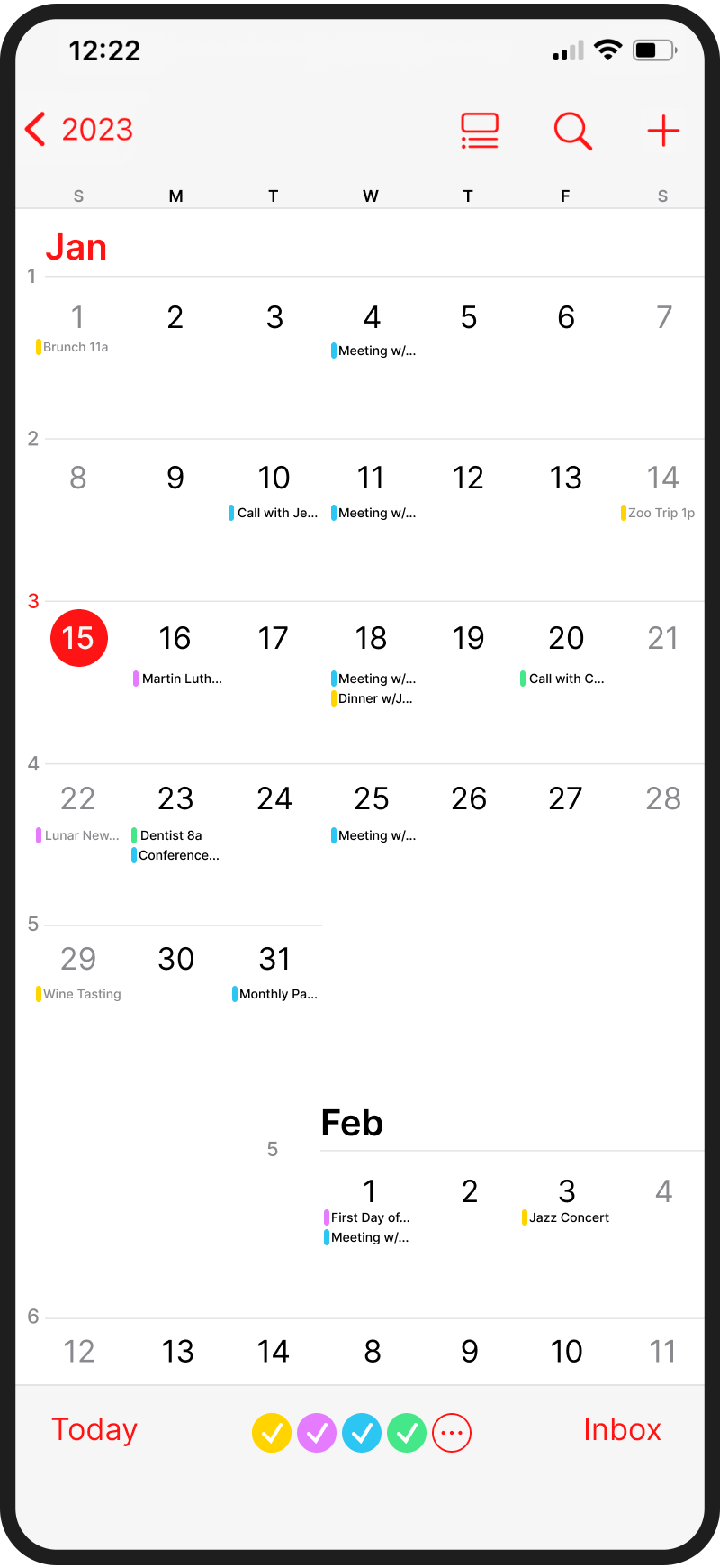
Top: Redesigned standard month view. Right: Redesigned week view.
Problem TWO:
Visual representation of events
One user who dropped the iOS calendar in favor of Google’s calendar said,
“I do not like the way events display in [the ios] app - it doesn’t provide information at a glance. categorization tools are sub par to its competitors and I generally find it too basic for my needs.”
Let’s talk about the gray dots.
In the iOS calendar, events are marked as nondescript, gray dots in the month view screen. They signify that there is an event on that day, yet nothing more. The gray dots don’t tell you whether February 16th is a US postal holiday, your brother’s birthday or the day you have an important meeting. In fact, it could be all three, but the singular, colorless ellipse remains.
The most frustrating part of this design decision is the missed opportunity to provide valuable information to the user via color coding, icons or text.

Here is where Apple’s minimalist design approach gets in its own way. Why not provide affordances to the user about what’s actually scheduled? The user must click each day to glean information. Consequently it can give the illusion of a full schedule, when that’s not the case. Simply put, it wastes users’ time.

Note how the list displayed in the image only includes events for the singular selected day.
There is one other way to view events vertically. By clicking the list view icon at the top right of the calendar (highlighted in red), you can see a list of the selected day’s events.
Notably there is no week list view, so seeing an entire week’s worth of events requires the user to click each day and attempt to remember them as a group, an unnecessary cognitive load to place on the user who wants to get a quick overview of their week, or switch to the less-than-optimal horizontal week view discussed earlier.
Solution Two:
The need to create more information density in the calendar’s visual display feels slightly contradictory to Apple’s design aesthetic. On the other hand, what good does a clean, visually-appealing design do if it means a poor user experience?
Solving this particular problem meant striking a thoughtful balance that felt true to Apple’s established brand and style guide while injecting some visual cues to help the user with scheduling tasks. Again, I referenced the Google calendar, trying to pull usability concepts without strictly recreating what Google has done already.
First, the calendar scale was stretched vertically allowing more space for information on each day. By switching the gray event markers to color-coded markers, the user has one additional piece of information about the calendar event.
Next, a text preview of the event was added to give the user another visual cue. The added information is enough to enable at-a-glance schedule checking, without unnecessary interface crowding.

Problem three:
Category toggling
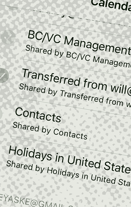
One iPhone user explained,
“Categorization is extremely important to me. The iOS calendar is particularly annoying in this regard as it only comes with “work” or “home” as standard categories. I prefer outlook because I’m able to set up as many categories as I want as well as allocating coding from a wider range of colors.”
While this response is not an accurate representation of Apple’s actual features (you can in fact set up multiple calendars with custom color coding), it illustrates how the average user is unaware of the full functionality of the app. In interviews, many users found categorization and toggling between calendars confusing or seemingly nonexistent.
Out of the six in-depth interviews, four USERS mentioned some need for categorization, whether through color-coding or through the use of multiple calendars with the option to filter event types when viewing the full month or week.
In both the original poll of forty iPhone users and in the six in-depth surveys, respondents frequently explained that they used multiple scheduling methods as a way to separate work life from home or other miscellaneous reminders. For example, they might use the iOS calendar for personal events, birthdays and the like and also use a Google calendar for anything work-related.
Toggling between iPhone calendars is done by pulling up a check list of calendars and selecting desired categories that are linked by e-mail account or user-defined. Regardless of the particular calendar the user is viewing, the previously mentioned visual representation of the events is all the same (gray dots) and there’s no annotation at the top of the screen. So again, the user has to remember which calendar(s) they are viewing, or select the date to see the event’s corresponding color code.
Solving this problem would mean creating a clear delineation when toggling categories and thus reducing the amount of work users do in maintaining multiple calendars.
Solution Three:
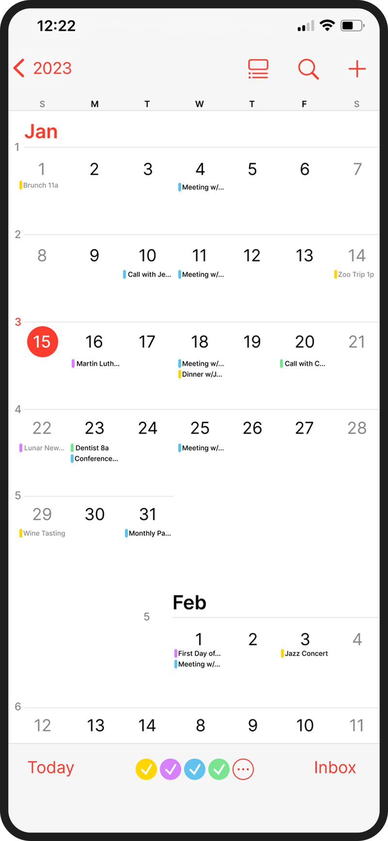
Rather than overhauling the iOS calendar interface, which could lead to alienation among current users, this particular pain point could be remedied by simply adding an additional affordance for the user. The addition of color-coded circular checkboxes in the lower portion of the calendar would allow users to toggle between calendars quickly to see the events by category. By also adding an expandable “…” button in this row, you can view more details such as calendar names and options to add a new calendar.

A simple addition of circular checkboxes to be added in the lower calendar menu.

conclusion
A better Ios calender
Through interviews with current iPhone users, common areas of frustration while using the iOS calendar were identified. These responses were distilled and categorized, resulting in three main opportunities for redesign.
The first of these problems is the general calendar layout. The vertical-to-horizontal phone holding felt disruptive to workflow, and the overall day, week and month view felt constrained. Utilizing a vertically-oriented layout made better use of screen real estate and prevented the irritating phone flip-flopping.
Next the visual representation of events was retooled. In this pain point, the gray dot event markers were redesigned with the introduction of color-coding and text previews for events. The new design creates a more informative interface, allowing users to quickly recognize what type of event is scheduled.
Finally calendar toggling was addressed. Previously users felt there was little-to-no categorization capabilities built into the iOS calendar. Many were unclear that calendars could be viewed separately at all. To solve this problem, a distinctive row of color-coded circular check boxes were added. This stays in line with Apple’s previously established style guidelines, while also granting an additional visual affordance to the user that they can in fact toggle between calendars.
These design changes, both big and small would contribute to ease of use and a calendar with well-defined events and categorization. Most importantly it could convert Google calendar users into iOS users and possibly even sway those who shy away from digital calendars to scheduling on their phones.
Upon viewing the iOS calendar redesign, one user stated, “This makes more sense. I think this would work better for me because it’s more detailed and I can see everything at once.” In a follow-up poll, the majority of iOS calendar users preferred the new design over the previous one.
Source citations
1. Share of smartphone users that use an Apple iPhone in the United States from 2014 to 2022. https://www.statista.com/statistics/236550/percentage-of-us-population-that-own-a-iphone-smartphone/
2. Bogdan, Apetrii. Vertical vs Horizontal Video. https://subsign.co/stories/vertical-vs-horizontal/
