DesIGN SYSTEM TO PROTOTYPE:

By Audrey Aske
ELITE EATS

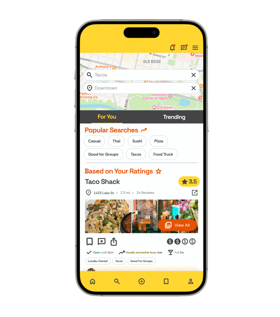
Elite Eats is a restaurant rating app, designed to compete with Yelp and similar review apps. The design focuses on a decluttered interface that’s approachable and fun to use. This project began with a concept and research, followed by a user flowchart and wireframe. Next I implemented a full-fledged design system that reflects playful, modern branding carried through the component and prototype design in a step-by-step atomic design process.
The Design System
Design systems create a framework for cohesion throughout the interface. Atomic design particles such as colors, fonts and dimensions are catalogued to ensure consistent branding and design rules.
In this project, I started with the basics: constructing a color system, tokenizing colors, padding, component sizing and corner radii. These styles were then applied to flexible component builds. By creating design tokens in Figma, and structuring files in such a way that changes cascade from the foundation file, to the components and then to the prototype, it allows for future changes to be rolled out universally in the design by simply changing the foundation values in the library, much like CSS is used in coding. Next I built each component and interaction, and finally, produced an MVP prototype using these building blocks.


Font, color and image choices were selected based on the brand mission and intended user persona. In this project, I used two brand colors, one primary and one secondary. Along with branding colors, messaging colors were selected: a “danger” color, used for highlighting concrete actions that might warrant a confirmation from the user, and a “success” color for actions that signify that a task has been completed successfully.
In choosing UI colors, shades of yellow and orange were used selectively to illicit feelings of hunger. Web Content Accessibility Guidelines (WCAG) shaped which shades were appropriate for text and vital information.
Component builds
If a component was to be used used multiple times throughout the product design, such as alerts, buttons, and overlays, it was created and added to a component library. Using auto-layout, instance swaps, boolean and appearance properties within Figma, these elements were built with flexibility in mind to adapt to the each use case in the final design. In the video below, I explain my design process with these flexible components.
Prototype build
Prototyping meant creating a meaningful experience for the user, with interactions that brought the brand to life - bouncy animations used sparingly, playful dialog and large buttons lend themselves to a feeling of friendliness, approachability and ease.
Tap the ‘play’ button below to explore the prototype.
